PT-BR
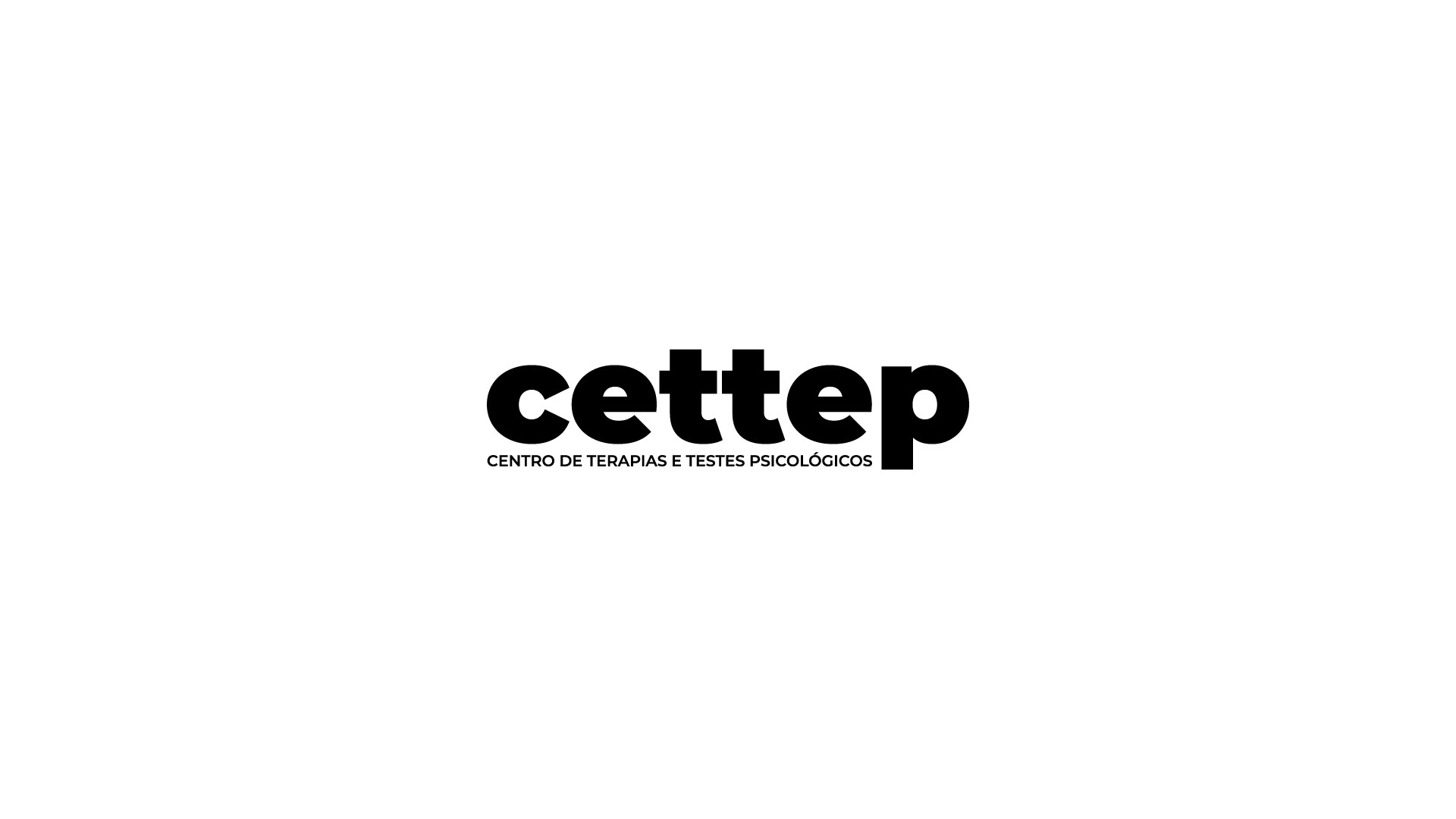
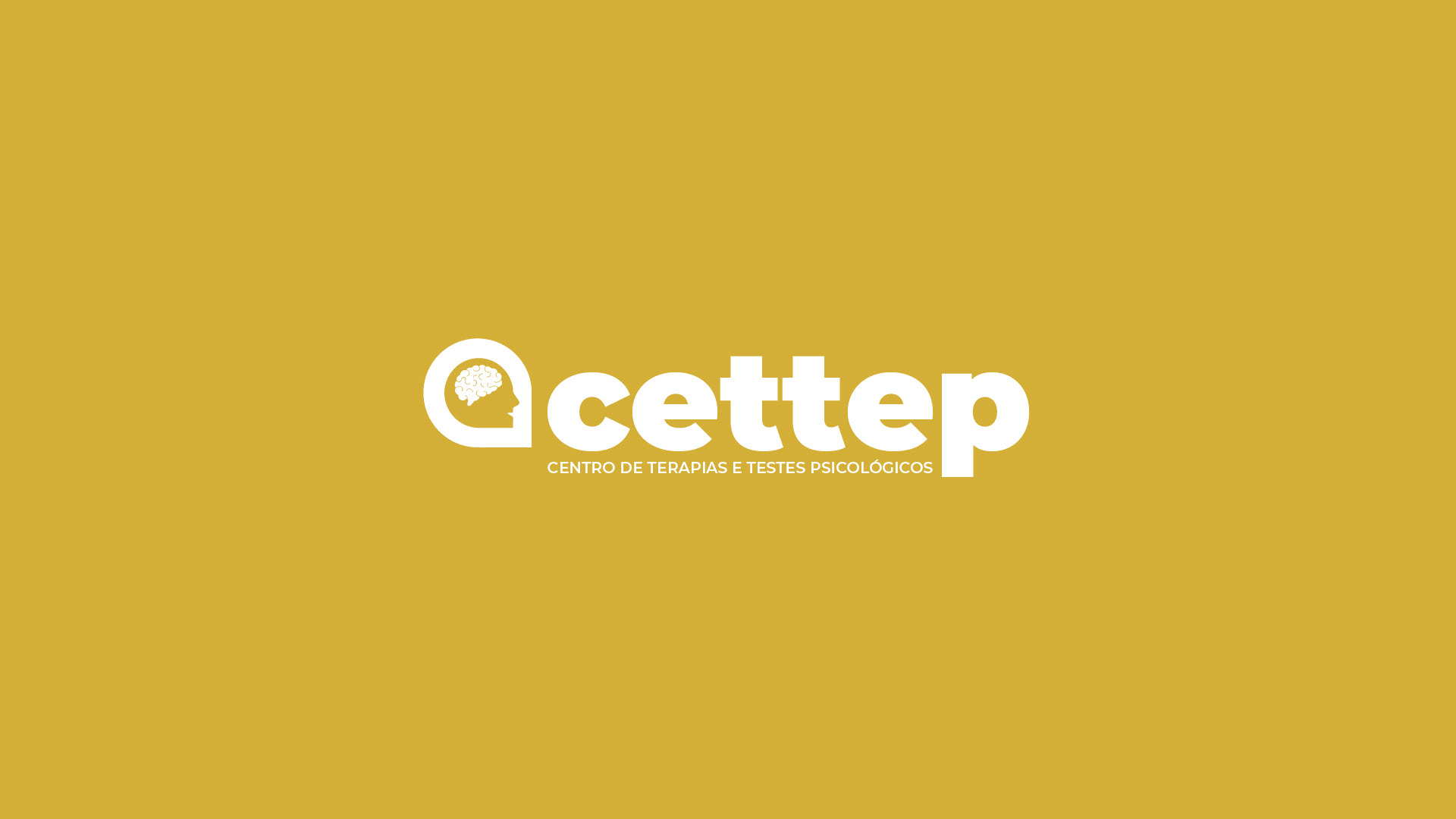
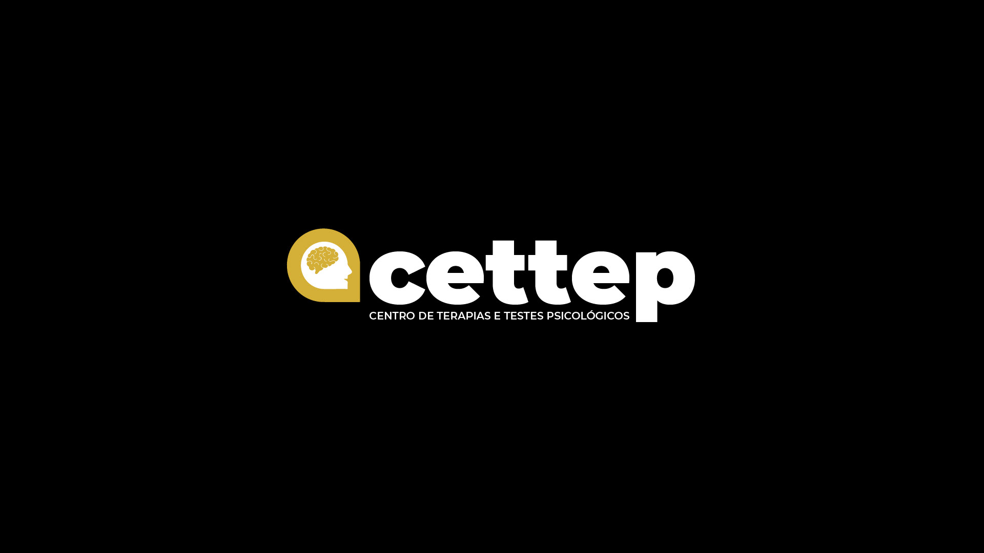
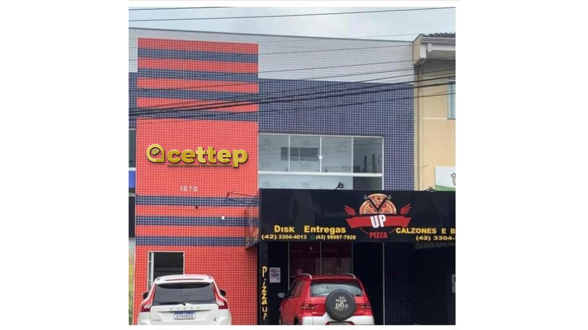
Quando o projeto do CETTEP chegou pra nós, o briefing pedia uma marca forte, que fosse de fácil visualização e que tivesse um ícone que representasse o serviço prestado. O desafio era reunir tudo isso em conjunto com a sigla que fazia referência direta ao serviço prestado.
Quando o projeto do CETTEP chegou pra nós, o briefing pedia uma marca forte, que fosse de fácil visualização e que tivesse um ícone que representasse o serviço prestado. O desafio era reunir tudo isso em conjunto com a sigla que fazia referência direta ao serviço prestado.
EN-US
When the CETTEP project came to us, the brief asked for a strong brand that was easy to see and had an icon that represented the service provided. The challenge was to bring all of this together with the acronym that directly referred to the service provided.
When the CETTEP project came to us, the brief asked for a strong brand that was easy to see and had an icon that represented the service provided. The challenge was to bring all of this together with the acronym that directly referred to the service provided.