PT-BR
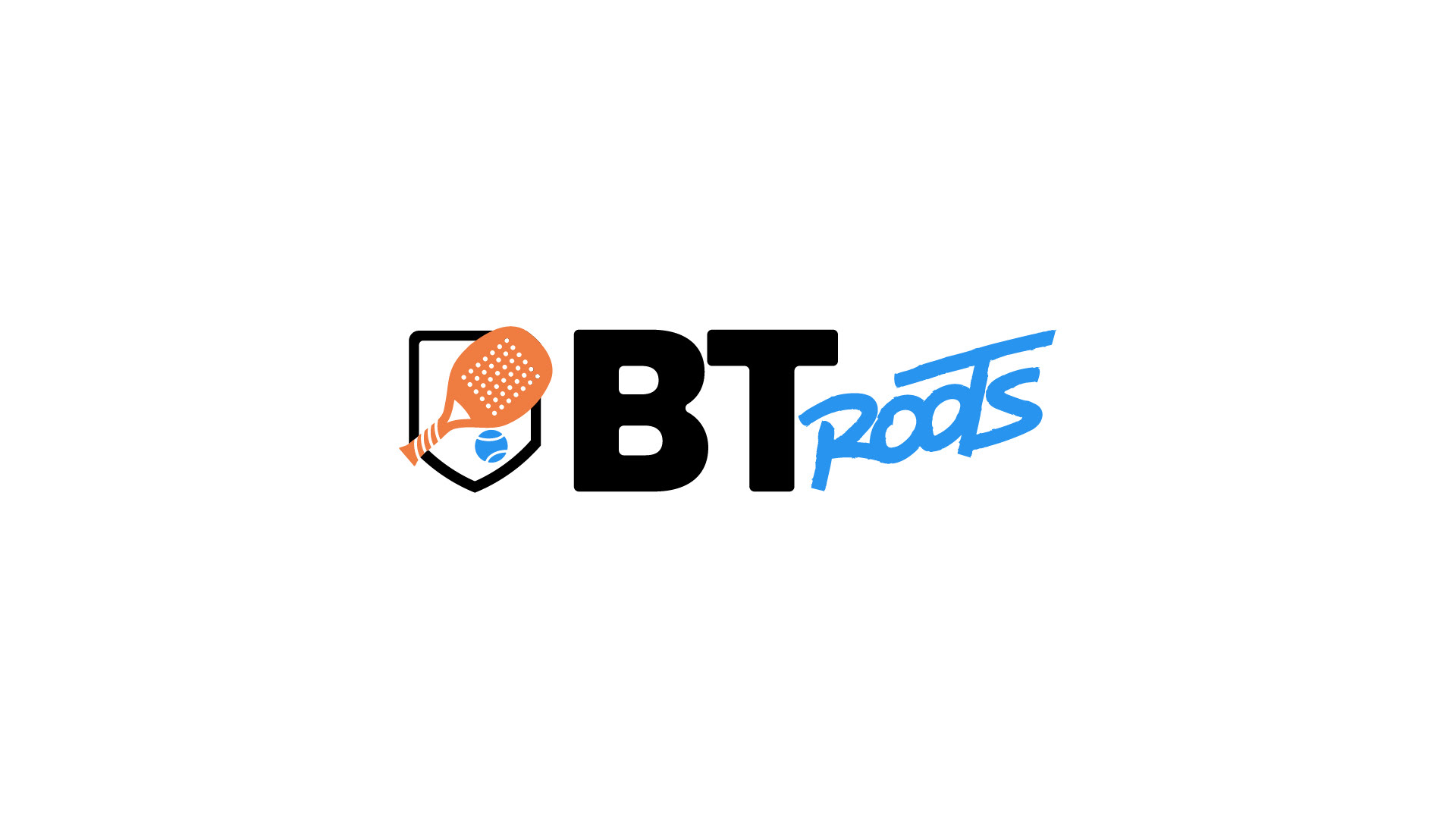
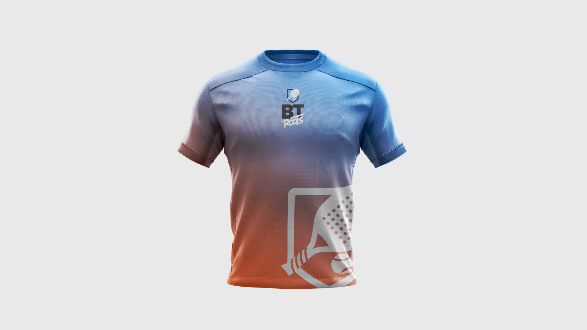
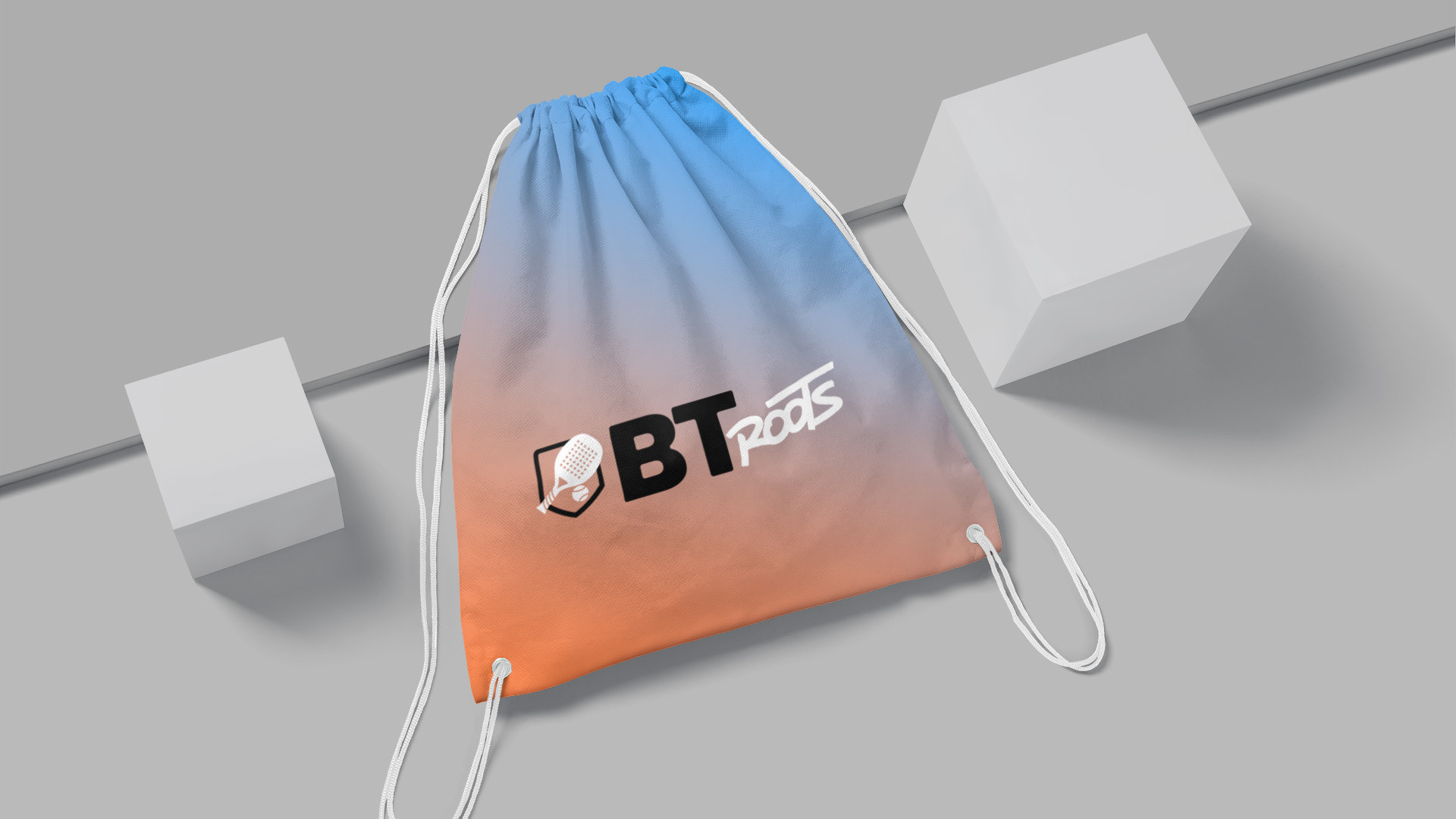
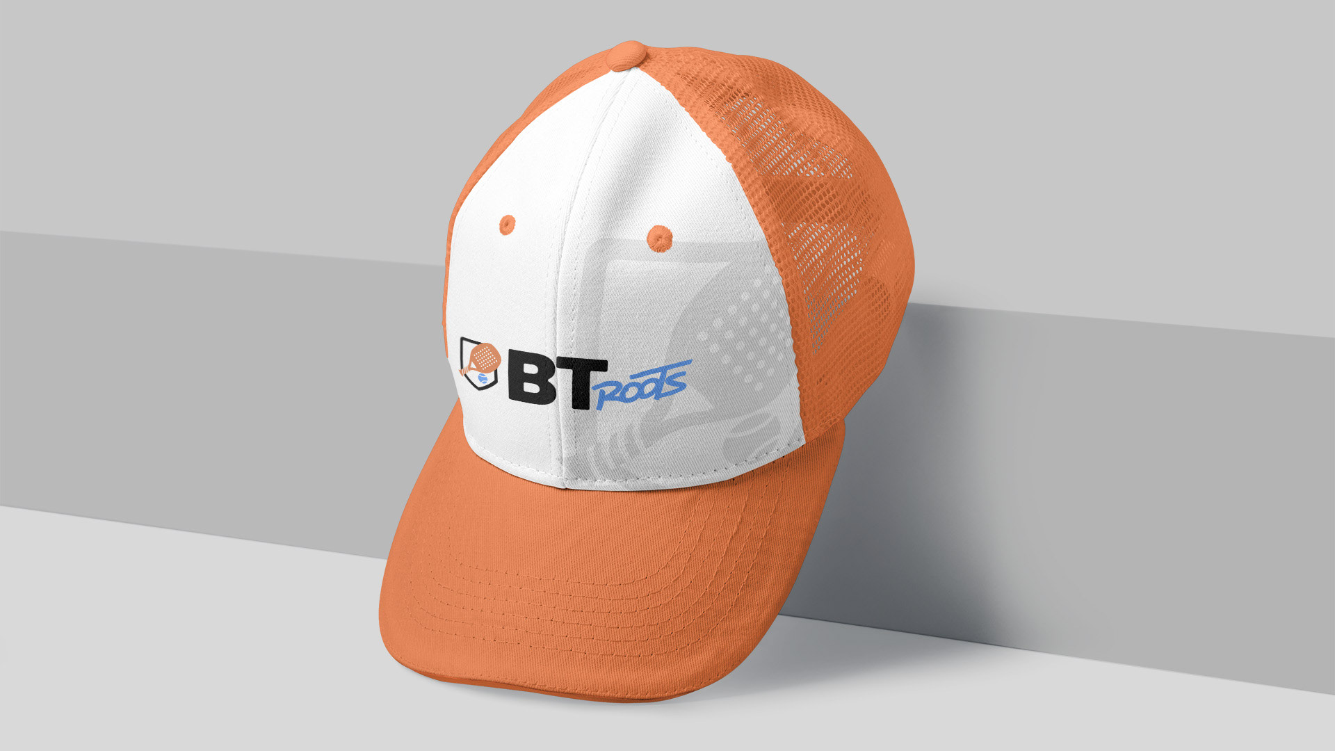
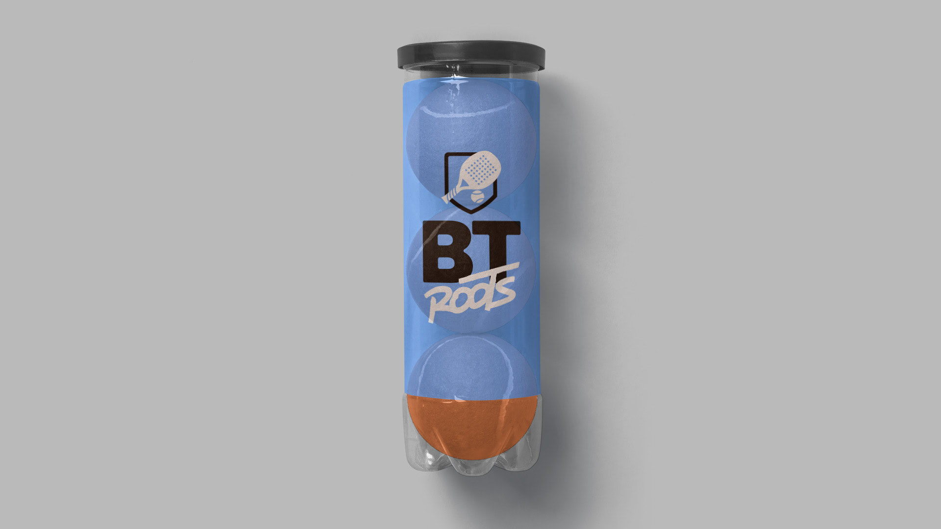
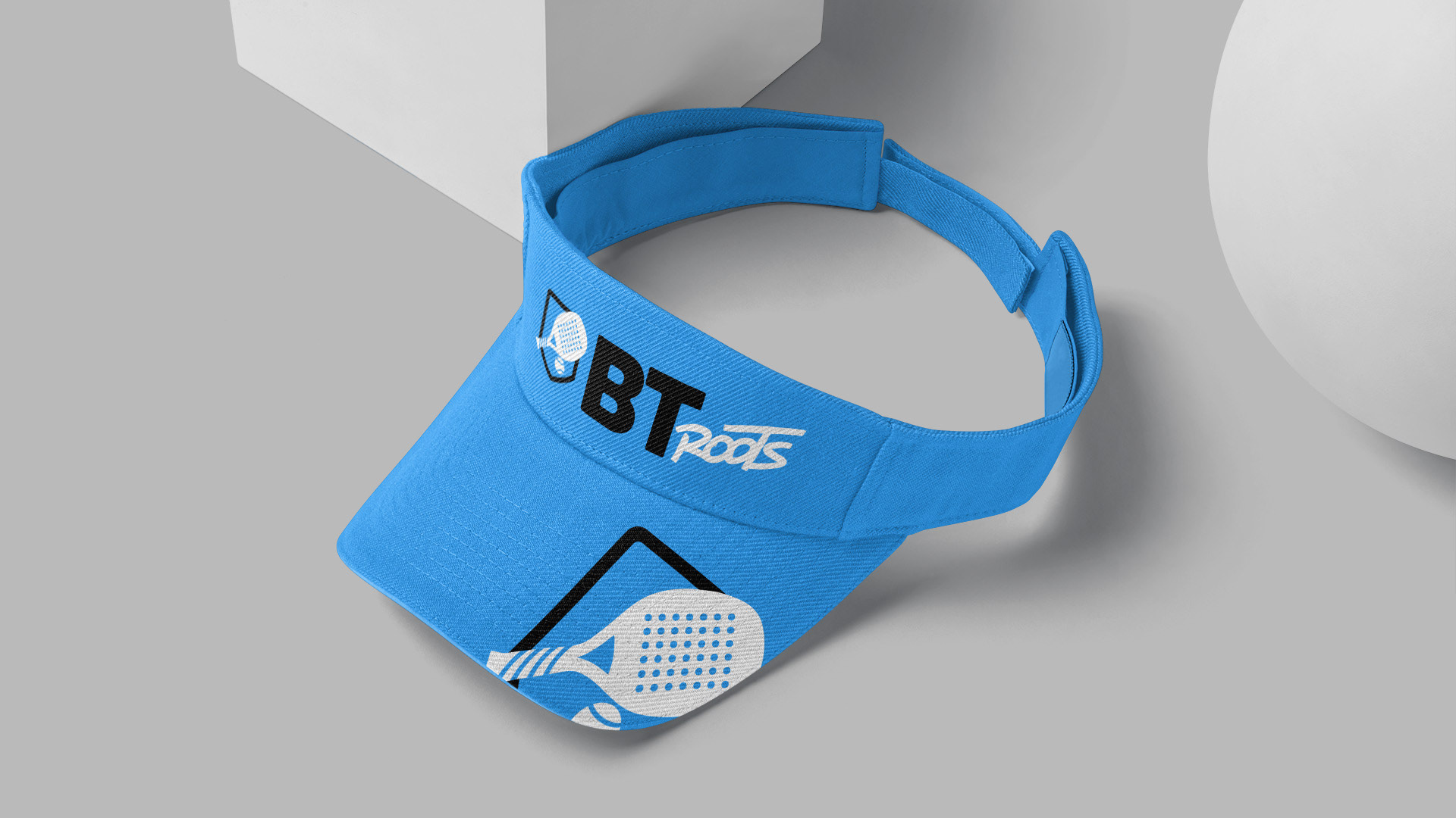
BT Roots é uma equipe de Beach Tennis. A ideia era que a marca remetesse às raízes do esporte, por isso a palavra Roots. A marca foi construída com elementos que remetessem ao esporte e que fosse usada como um escudo para os materiais da equipe.
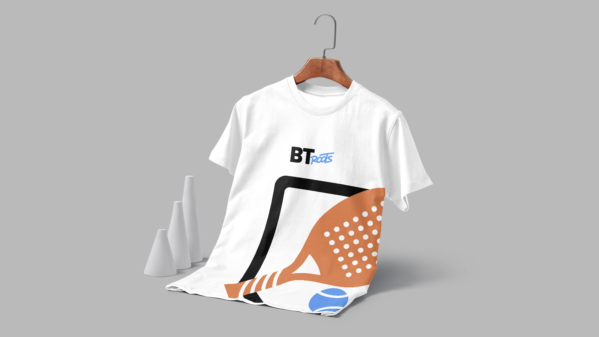
O projeto foi aprovado de primeira e já tem vários materiais sendo usados pela equipe.
Foi um prazer enorme fazer parte desse projeto e poder ter a liberdade de criar os materiais esportivos.
Objetivos do Projeto
Desenvolver a identidade visual completa para o BT Roots, para agregar valor e gerar reconhecimento da marca dentro do cenário esportivo, dessa forma, a marca já nasce forte e com uma percepção de valor enorme.
Atribuições da Marca
A marca é jovem, moderna e de fácil entendimento e leitura. Alguns elementos remetem às raízes do esporte, mas sem perder a essência com que ela foi criada.
Símbolo
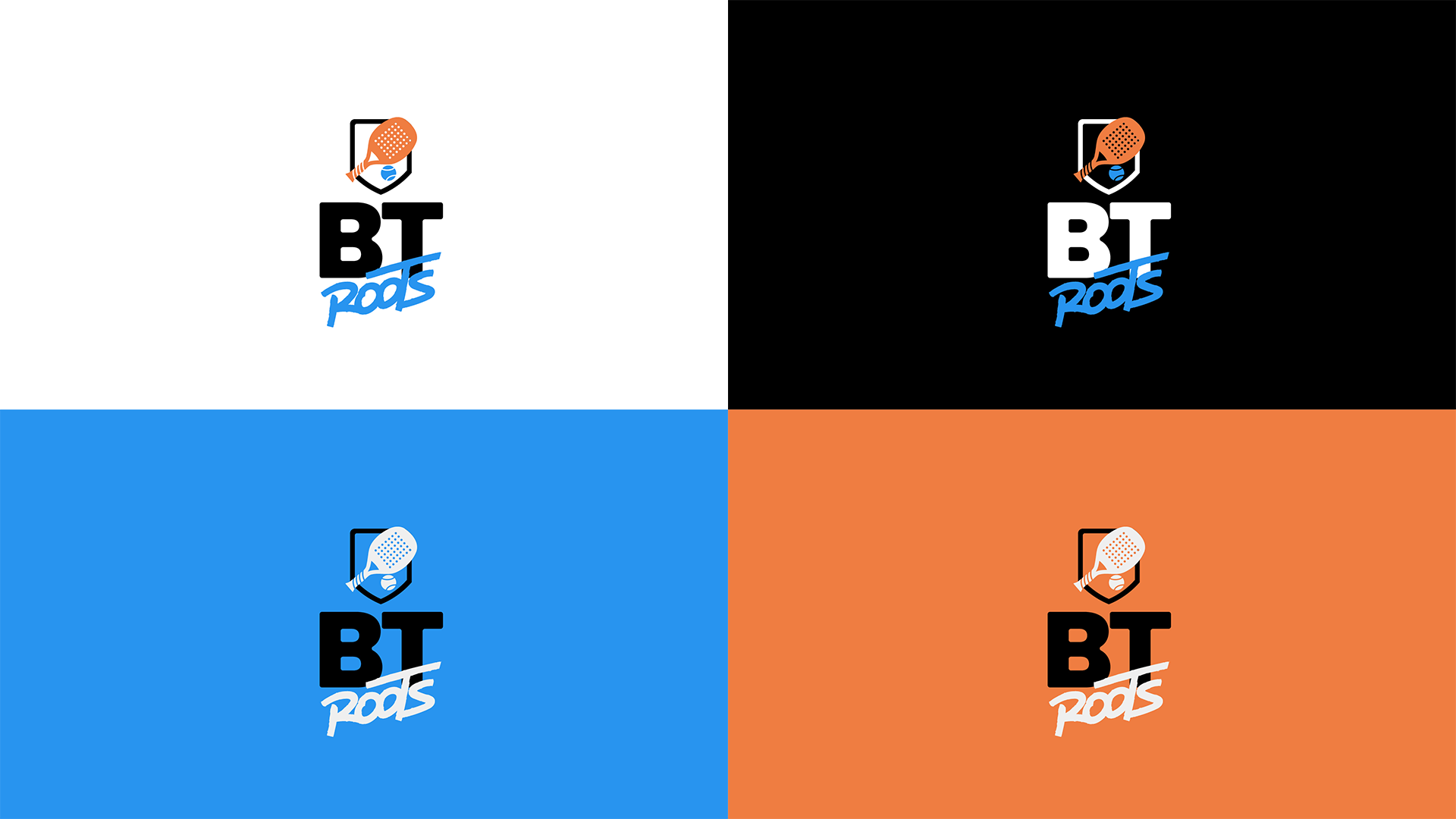
No símbolo, juntamos 3 elementos: o escudo, a raquete e a bola de beach tennis.
A ideia aqui foi trazer a lembrança das equipes de esporte com o escudo, identificando o beach tennis através dos outros elementos. A junção dos três trouxe harmonia, boa leitura e fácil entendimento.
Tipografia
A fonte escolhida foi a Poppins Extrabold que foi alterada e personalizada com cantos arredondados para carregar um visual mais leve e fazer referência à bolinha de beach tennis e também aos cantos arredondados da raquete.
Além disso, a palavra “ROOTS” foi escrita à mão, fazendo referência aos tempos antigos, onde se faziam letreiros e materiais de comunicação totalmente à punho, no melhor estilo roots!
EN-BR
BT Roots is a Beach Tennis team. The idea was that the brand would refer to the roots of the sport, hence the word Roots. The brand was built with elements that refer to the sport and that would be used as a shield for the team's materials.
The project was approved first time and several materials are already being used by the team.
It was a great pleasure to be part of this project and to have the freedom to create the sports materials.
The project was approved first time and several materials are already being used by the team.
It was a great pleasure to be part of this project and to have the freedom to create the sports materials.
Project Goals
To develop the complete visual identity for BT Roots, to add value and generate brand recognition within the sports scene, this way the brand is born strong and with a huge value perception.
To develop the complete visual identity for BT Roots, to add value and generate brand recognition within the sports scene, this way the brand is born strong and with a huge value perception.
Brand Attributions
The brand is young, modern, and easy to understand and read. Some elements refer to the sport's roots, but without losing the essence with which it was created.
The brand is young, modern, and easy to understand and read. Some elements refer to the sport's roots, but without losing the essence with which it was created.
Symbol
In the symbol, we put together 3 elements: the shield, the racket and the beach tennis ball.
The idea here was to bring the memory of the sport teams with the shield, identifying beach tennis through the other elements. The junction of the three elements brought harmony, good reading and easy understanding.
Typography
The chosen font was Poppins Extrabold which was altered and customized with rounded corners to carry a lighter look and make reference to the beach tennis ball and also to the rounded corners of the racket.
In addition, the word "ROOTS" was handwritten, referring to the old times, when signs and communication materials were made entirely by hand, in the best roots style!